

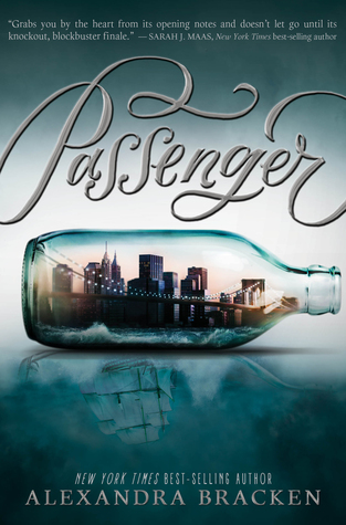
The bottle holds New York City where the main character Etta resides. The reflection of the city resembles a ship which is very important to the plot of the novel. A ship represents travel back in time. It represents history. Any type of transportation could have been reflected in the water but it makes sense to have a ship since ships have been around for a long time. In this sense, the ship can take you anywhere back in time.
The decorative typeface for the title bleeds off the page which is a nice touch. It reminds me of how people believe ships would sail off the map because they thought the world was flat. The slight cursive script hints to the past where cursive reined over print.
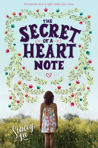
The Secret of a Heart Note by Stacey Lee is Lee's first contemporary novel and it shows in the cover design of the novel. This heartfelt novel translates well with a soft pale blue background and the title is framed with flowers. Because Mim and her mother are aromateurs, flowers and herbs are very important to fine-tuning a person's essence. Blue creates a sense of calmness and relaxation. Blue is giving and is not a taker.
Showcasing Mim looking into the plant life indicates Mim searching for something. She is always helps others find love. However, Mim never looks for love but even though she tries her hardest not to fall in love, love finds her instead. Because she is always gathering different flowers and herbs for her perfumes, it is fitting that she walking through nature. Mim is also soul searching and trying to come to terms about who she is and what she wants in life.
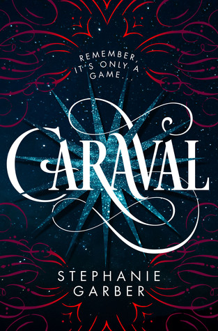
The background is mysterious and magical just like the games. The red reminds me of the mysterious roses in the rooms. Even the whimsical shapes of the red lines look like petals. The red represents a sense of urgency. It's an urgency for Scarlett to find her sister Tella. Also, red can also represent Scarlett herself. Scarlett is following her childhood dreams to attend the mysterious Caraval but she needs to find and save her sister.
Keeping the rest of the type in a sans serif font creates a focal piece for the title Caraval. The way the blue star and the red wisps are located, it creates a stage for Caraval. All eyes are on the stage and hence the show.
Erin Fitzsimmons and Ray Shappell did a fantastic job with designing the cover to Caraval!
What do you think about the cover art for these three lovely novels? Have you read any of them?

I was extra impressed with the cover of Passenger (and Wayfarer) when I learned that the title text was hand lettered. So cool! I loved the book and it has become one of my all-time favorites. I also read Caraval and I enjoyed how the colors and style directly referenced the text. I saw the colors as being in the first dress Scarlett gets at Caraval and the imagery reminded me of Legend's symbol for the game.
ReplyDeletePassenger and Wayfarer have some of the most beautiful cover designs and I love the hand lettering. I agree with you about how the Caraval imagery correlates with Legend's symbol for the game.
Delete