Typography Talk is an original feature where I discuss about book cover design and typography. Even though people always say that you shouldn't judge a book by its cover, you know everyone does. A book's cover art needs to captivate the potential reader. There are some readers who will be more inclined to purchase a book not only based on the synopsis, but also based on how the cover looks like. Colors, typeface, medium, spacing and originality are all factors that help make up a cover.
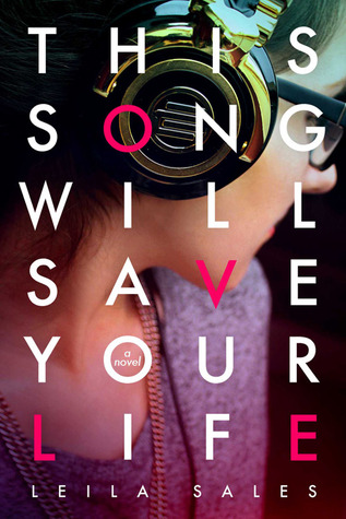
This Song Will Save Your Life by Leila Sales has an intriguing cover. Because each word in the title is only four letters long, having justified type spacing works well. The background conveys how the book is somehow related to the music and we can assume the girl on the cover is either the main character or a girl with importance in the book.
I do like how the cover artist decided to use a photograph to convey the tone of the book instead of creating a graphic for the cover.
Having the words in a simple sans-serif typeface is easy to read especially when the lettering is in white. The pink lettering spelling out LOVE pops off the cover. It has a good contrast from the clean white lines.
Under A Painted Sky by Stacey Lee has a gorgeous cover. The ombre sky definitely works well with the title of the book and the silhouettes of Andy and Sammy puts the spotlight on the female characters in the book.
The dark blue/purple title type is simple yet stands out from the watercolor like background. I like how the title looks like it's slightly sponge painted sans-serif. Having Stacey Lee's name in a loopy more decorative font goes well with the curves of the zodiac animals and adds elegance.
From far away, readers can see squiggles that actually Chinese zodiac animals. Snakes, rabbit and dragons are depicted on the cover. These animals have great meaning because they correlate with certain characters in the novel. When I look at the cover, I know the characters will be embarking on a journey. Sammy can be seen with the violin which is significance in the story.
Inked by Eric Smith has a pretty awesome cover. Because the novel is about the magic of tattoos, the typeface is perfect! Not only the title look like a tattoo but the lime green and cyan outlines/glow makes it pop out of the blue cover. The glowing is significant in the book. I absolutely love the contrast in colors. Because tattoos are so important in
Inked, it's great that the title is the focal piece.
The intricate floral pattern frames the tattoo title and looks nice in front of the starburst lighting blue pattern. Lighting is super important to the plot so it's nice that the lighting is incorporated but it's subtle. Just by looking at the cover, readers know the novel is a fantasy.
If you want to know more about the cover process, check out what Jenny Zemanek, Eric Smith's cover artist, has to say
here.


I'm definitely guilty of judging a book by it's cover. The cover grabs me, then I read the synopsis, and I go from there.
ReplyDeleteThis is an awesome feature!
I've always loved the cover of This Song Will Save Your Life. I didn't even notice the LOVE on the cover. Hidden messages. This title and cover always reminded me of Garden State, the movie. The line from the movie, though, was "This song will change your life."
I love the cover for This Song Will Save Your Life. It's simple but lovely.
DeleteLove this feature! It's so fun looking at book design. I totally agree with you about This Song Will Save Your Life (it's the only one I've read of these three so far). For that particular book I also like that there is a sort of secret message stamped on the actually board of the front of the book. It's a really well-put-together package.
ReplyDeleteI definitely agree it's a really well-put-together package. It's simple yet creative!
Delete