

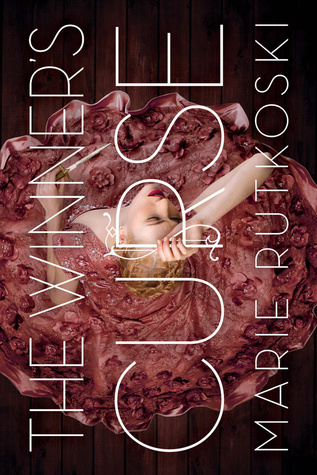
Without reading the book, it is assumed the girl is the main character of the book. I love how Kestrel is holding the R of Curse. The cover artist incorporated the type with the image as if they are one.
The type being rotated at a 90 degree angle is a nice touch as well. It makes the book unique and I love the sans-serif justified type.
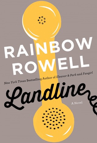
Landline by Rainbow Rowell has a simple cover. The title is in a more decorative typeface and I Landline. The spine is gorgeous too. I would not expect the pink at all but the pink stripes works well with the overall packaging of the novel.
love how the cover artist incorporates a telephone coil at the end of
The magical yellow telephone is the focal piece of the cover which makes sense since it plays a huge part in the plot of the novel. The neutral colored background makes the yellow phone pop out more.
Keeping the author's name in a simple sans-serif font in white shows nice contrast with the black hand-lettering of the title.
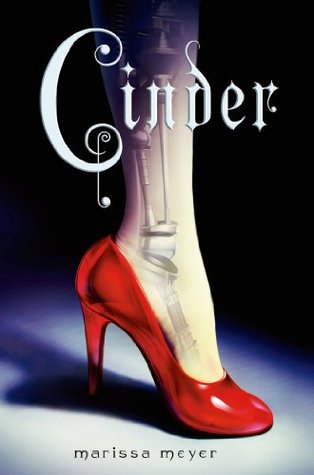
The red high heel is the focal piece of the cover. Your eyes focus on the shoe and then to the leg. The artist did an excellent job hinting Cinder is a Cinderella retelling with the main character being a cyborg. The spotlight on the leg and heel indicates Cinder is the main character in the novel. The ombre gradient of black to blue to a faded white draws more focus on the shoe.
I love how Meyer's name is in a subtle decorative typeface in the spotlight. It doesn't distract the reader's eyes from the title or the heel.

No comments:
Post a Comment