


The cover design conveys the general gist of the story quite well. With its steampunk elements and an exhibition in Skemantis, the landscape fuses in with the city. The tree presents the Oldtown Arboretum that Grit lives in. Grit is also shown standing on a pedestal with one wing.
The type for the author's name works well and looks like there is a banner introducing people to this wonderful world. I love the typeface chosen for the series title. It's rigid corners represent the analytical thinking and the yellow to orange-red gradient and the glyph marks around Grit adds a playful touch.
The colors of blue and orange work well because they are opposites on the color wheel. Although the steampunk elements are harsh on the eyes with the dark colors, the intricate designs along with the pastel colors soften ambience.
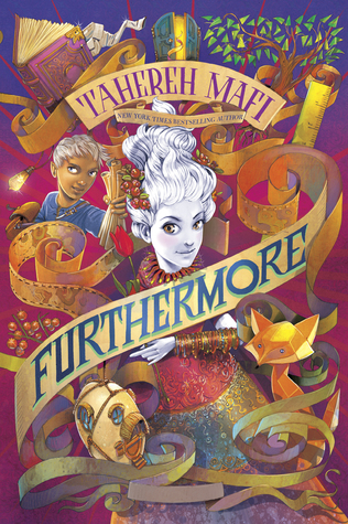 Furthermore by Tahereh Mafi is a whimsical and colorful novel which accurately describes the novel. The main character, Alice, is born without pigment in the colorful world called Ferenwood. You can see her pictured in the center of the cover design. Every item depicted on the cover holds significance. The fox, the bangles, the ruler and paper scrolls all play a part in the plot. Oliver, who is standing next to Alice, plays an important role in the story and is Alice's adventurous companion.
Although the cover seems a bit cluttered, it works in the sense that when Alice and Oliver visit Furthermore, the world is not what you expect it to be and it is all over the place. The main color scheme on the cover taps into complementary colors. Purple is often next to yellow. Oliver's blue shirt in the top left is complementary to the orange fox located on the bottom right. These colors and the placement of the colors provide a nice balance despite the cluttered design.
The title of the book is part of one of the paper scrolls. The paper scroll is never-ending, sort of how Furthermore is. Having the type in block capital letters provides some structure in the crazy world of Furthermore. The contrast works well.

In terms of the rest of the cover design, the gold lettering and magical creature design pops from the midnight blue background. The raised metallic areas had a nice touch to the cover art. I love seeing magical creatures such as the Swooping Evil and Niffler depicted on the cover since readers and viewers of the film will come across these creatures. The small yet significant quill separates J.K. Rowling's name and the title of the screenplay.

No comments:
Post a Comment