Showing posts with label The Wingsnatchers. Show all posts

Friday, July 7, 2017

Typography Talk (5)

Typography Talk is an original feature where I discuss about book cover design and typography. Even though people always say that you shouldn't judge a book by its cover, you know everyone does. A book's cover art needs to captivate the potential reader. There are some readers who will be more inclined to purchase a book not only based on the synopsis, but also based on how the cover looks like. Colors, typeface, medium, spacing and originality are all factors that help make up a cover.


The Wingsnatchers by Sarah Jean Horowitz is a whimsical middle grade novel about a magician apprentice, Carmer, who loves tinkering and inventing. Grit is a one winged fire faerie princess who ends up befriending Carmer by accident.

The cover design conveys the general gist of the story quite well. With its steampunk elements and an exhibition in Skemantis, the landscape fuses in with the city. The tree presents the Oldtown Arboretum that Grit lives in. Grit is also shown standing on a pedestal with one wing.

The type for the author's name works well and looks like there is a banner introducing people to this wonderful world. I love the typeface chosen for the series title. It's rigid corners represent the analytical thinking and the yellow to orange-red gradient and the glyph marks around Grit adds a playful touch.

The colors of blue and orange work well because they are opposites on the color wheel. Although the steampunk elements are harsh on the eyes with the dark colors, the intricate designs along with the pastel colors soften ambience.
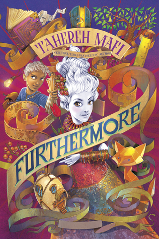
Furthermore by Tahereh Mafi is a whimsical and colorful novel which accurately describes the novel. The main character, Alice, is born without pigment in the colorful world called Ferenwood. You can see her pictured in the center of the cover design. Every item depicted on the cover holds significance. The fox, the bangles, the ruler and paper scrolls all play a part in the plot. Oliver, who is standing next to Alice, plays an important role in the story and is Alice's adventurous companion.

Although the cover seems a bit cluttered, it works in the sense that when Alice and Oliver visit Furthermore, the world is not what you expect it to be and it is all over the place. The main color scheme on the cover taps into complementary colors. Purple is often next to yellow. Oliver's blue shirt in the top left is complementary to the orange fox located on the bottom right. These colors and the placement of the colors provide a nice balance despite the cluttered design.

The title of the book is part of one of the paper scrolls. The paper scroll is never-ending, sort of how Furthermore is. Having the type in block capital letters provides some structure in the crazy world of Furthermore. The contrast works well.

Fantastic Beasts and Where to Find Them screenplay by J.K. Rowling has one of my favorite type treatments for a logo. For the new Harry Potter related franchise, Fantastic Beasts and Where to Find Them is a series about Newt Scamander's magical creatures. Newt steps into 1926 New York City where everything is proper and structured. Most of the typeface of Fantastic Beasts is structured in all caps serifs except for some details that add a bit of character. The whimsical S represents the Occamy, which is a magical creature that is serpent like that can grow and shrink in size. Some of the letters also have some fur or feather like appendages. You can say that the logo is very beastly! For more information about the logo design, check out this Pottermore article.

In terms of the rest of the cover design, the gold lettering and magical creature design pops from the midnight blue background. The raised metallic areas had a nice touch to the cover art. I love seeing magical creatures such as the Swooping Evil and Niffler depicted on the cover since readers and viewers of the film will come across these creatures. The small yet significant quill separates J.K. Rowling's name and the title of the screenplay.

Friday, April 14, 2017

The Wingsnatchers by Sarah Jean Horwitz

Title: The Wingsnatchers
Author: Sarah Jean Horwitz
Publisher: Algonquin Young Readers
Publication date: April 25, 2017
Pages: 352
Source/format: ARC from Emma of Missprint as part of the ARC adoption feature

Rating: ☆☆☆ 

Synopsis (from goodreads.com):

A stunning debut about a magician’s apprentice and a one-winged princess who must vanquish the mechanical monsters that stalk the streets and threaten the faerie kingdom.

Aspiring inventor and magician’s apprentice Felix Carmer III would rather be tinkering with his latest experiments than sawing girls in half on stage, but with Antoine the Amazifier’s show a tomato’s throw away from going under, Carmer is determined to win the cash prize in the biggest magic competition in Skemantis. When fate throws Carmer across the path of fiery, flightless faerie princess Grit (do not call her Grettifrida), they strike a deal. If Carmer will help Grit investigate a string of faerie disappearances, she’ll use her very real magic to give his mechanical illusions a much-needed boost against the competition. But Carmer and Grit soon discover they’re not the only duo trying to pair magic with machine – and the combination can be deadly.

In this story perfect for readers of the Lockwood & Co and Wildwood series, Sarah Jean Horwitz takes readers on a thrilling journey through a magical wooded fairyland and steampunk streets where terrifying automata cats lurk in the shadows and a mad scientist’s newest mechanical invention might be more menace than miracle.

M Y  T H O U G H T S

Thirteen-year-old Felix Cassius Tiberius Carmer III is the apprentice to magician Antoine the Amazifier. Carmer is also an inventor and he enters an Seminal Symposium of Magickal Arts, an engineering exhibition, in Skemantis after seeing a flyer advertising the exhibition. Carmer has always been fascinated about tinkering and creating ever since he was a young boy.

At five inches tall, Princess Grettifrida Lonewing but prefers to be called Grit, is a fire faerie with one wing living in the Oldtown Arboretum. However, she doesn't let her one wing stop her from doing what she wants. All though others laugh or pity Grit, it only makes her stronger. Grit just wants to fit in with everyone. Trying to fit in and finding a sense of belonging is difficult for many children and teens, especially if one has a disability or are seen as an outcast. The Wingsnatchers will reassure children and teens that even though they don't fit it, they are unique and they can make a difference.

Free Folk, faeries who do not belong to a court or kingdom, have gone missing for a few months and someone or something has been harming faeries while snatching their wings. Grit meets Carmer when she mistaken him as a Friend of the Fae. With a fate on their side, Grit and Carmer make a deal, one where Grit will help Carmer win the exhibition if Carmer helps Grit find out who is attacking the faeries. Two contrasting entities are able to work together to each other utilizing their strengths. This is good for children and teens to read about. Sometimes you befriend people in ways you don't expect and sometimes you have to work together in order to reach a goal.

The Wingsnatchers is a whimsical book and introduces a fresh take on magic. Sarah Jean Horwitz infuses steampunk in this lively adventurous fantasy. I am not usually found of stories about faeries but Horwitz has captured my attention with Grit. Despite missing a wing, Grit is a strong female who knows what she wants and she doesn't give up.

The Wingsnatchers is a dark fantasy novel with a touch of steampunk and magic that is engaging for all ages. This middle grade novel is definitely one to check out if you're looking for a unique fantasy read.